Although this takes a while to load, it is really fascinating and beautiful website. It has a number of photographic and arty projects on it, which are pretty interesting. However the bit I really love is when you first enter the website: there is a rather amazing video/animation that uses actual film combined with child-like drawings that animate before your very eyes.
Today I decided to play around with my printer, which has a scanner/copier function on it! Not just for the heck of it obvisously... we have a photocopying/xerox brief to see what type of things we can get to represent movement!
Only fooling around but it gave me some pretty interesting results.
Dr pepper bottle with water in, rotated across the screen. Kinda cool cuz the water makes it look all ripple-y:
2p coin pushed across the surface: (The line is where the scanner seems to stop halfway through)
Cool sewing machine that is able to represent sound through the height of stiches it creates. I particularly thought this was interesting in reguards to our new soundscape project and the sketchbook work.
Really cool designer, who does a lot of interesting stuff with typography. I particularly like this piece to the side as they have used the text to create a kind of illustration. I also like some stuff they have done with cutting lots of paper out to create 3d typography.
This is not design in any way, shape or form, I found it on geekologie.com (which is an ace website) but I thought it was interesting because the person thought very outside the box, which is after all what we should be doing! (I think) ... and because it's funny.
It doesn't actually have any wookies in. However! It has lot's of happy birthdays. We made them in typography the other week and I've finally decided to take some photos.
I'm currently working on a project were we have to find neglected city type, catalogue it and make it into some kind of outcome. (most likely a book)
Here are few of my favourites from the neglected type I have gathered thus far. I have been around both Nottingham (my home city) and Lincoln. I want to use both cities to create a transition between the two.
I have also been looking at cigarette packets and signs quite a lot because not only are these neglected (thrown on the floor, mis-used, torn etc.) the packets themselves are neglected by the people smoking the cigarettes, avoiding the messages such as 'smoking kills'.
Although their fonts arnt really my sort of thing, I do love the actual design on the website.
The text which reads almost like a 'Manifesto' or list of achivements and uses their own typefaces, one for each lines, which are highlighted when you rollover and you can click to see the font. Simple but very nice.
I heard of this game a while ago but this week it popped up on 'Steam' that it was on offer for just $2.49!!! so I decided to indulge, I mean heck even if it wasn't good, what's £1.20 for a bit of entertainment?
Audiosurf is a game that allows you to insert your own music into the game and play a long to it. The game analyses your music and uses this information to inform shape, sound, colour, and speed to make each race truely unique. To add to this each song has a top score board, which means that you still want to play a level over and over to get better and not just for curiosity.
I've played it a bit and I think it's a really decent idea, though the racing doesn't really go to a beat like you'd expect. It's all about collecting certain coloured cubes, so it still really is more of a game appose to some of the simulation experiences such as Guitar Hero or DDR. However as the music gets faster, so does the track, as it gets more dramatic, the colours heat up. So you still get the rushes of andrenaline and excitement in co-ordination to your music. It will never get old because there will always be a new track to play to! Genius.
Pretty nifty and well worth the money really. If you can get on steam, I'd definately reccomend it while it's on offer. Usually it will set you back $9.99 (about £5)
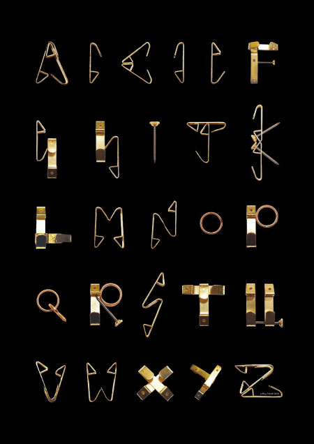
Just found this via swissmiss again, thought it was very interesting, and particularly relevant to our elastypography project.
I particularly like the way they've used the dif views of the hook, either the side or the front. It gives a completely unique effect, especially when combined.
 Although this takes a while to load, it is really fascinating and beautiful website. It has a number of photographic and arty projects on it, which are pretty interesting. However the bit I really love is when you first enter the website: there is a rather amazing video/animation that uses actual film combined with child-like drawings that animate before your very eyes.