Sunday, 21 December 2008

Star Wars Wii


Wow! This is a customised star wars wii! I'd love to own this personally, shame it's like $500. Though that's not bad considering the effort somebody's put into making it!

Features:
· Custom Black Case!
· Eighty-Five (85) Fiber Optic Stars
· Some Stars Fade In and Out
· Custom, Red Light Bar!! Which looks like its breathing!
· Hand Painted Death Star, X-Wing, and Darth Vader Tie-Fighter!
· Star Wars Logo in Brass!! Backlit with Yellow LED's!
· You Can Change the Fading mode to Constant ON!
· Wiimote and Nunchuk have Custom Red LED Lights in them!!

Sourced at geekologie

Ebay auction is here: http://cgi.ebay.com/ws/eBayISAPI.dll?ViewItem&item=110325376401, it seem's nobody bought it!

Giant Street Tetris!


Awesome street-sculptures! Who doesn't love tetris?

Click here for more info.

Saturday, 6 December 2008

Owl City Website

Just realised I never posted my website on here, so here it goes. This was for my digital practice lesson and it was to make a website using HTML and CSS for a music artist/band. I chose 'Owl City' an unsigned solo artist (despite being one of the most viewed on myspace) he makes cutesy electronic music which I took a liking to. I also thought it generated a lot of imagery ideas that I could use.

Here is my main page:


And here is a general walkthrough of my website:

Click to enlarge.

Projection Art


Cool video that shows lots of different projections onto various 3d environments using some sort of 3d mapping system. My favourite is probably the projection of the buildings lights going on and off, simple but very clever.

You can view the website here

Salt Sound Waves


I have no idea how this works, but it's pretty cool. It's an experiment using salt to physically represent sound, as the pitch gets higher the salt moves around and creates different patterns.

Warning: I'd turn your speakers down!

Thursday, 27 November 2008

Project 77

Although this takes a while to load, it is really fascinating and beautiful website. It has a number of photographic and arty projects on it, which are pretty interesting. However the bit I really love is when you first enter the website: there is a rather amazing video/animation that uses actual film combined with child-like drawings that animate before your very eyes.

Check it out: http://www.protect77.com/

Monday, 24 November 2008

Cutout type books.


Books that have been cut into and painted over to create weird effects. I particularly like the one above as it looks a bit like a maze.


See more from Brian Dettmer here

Sunday, 23 November 2008

Yes you can!


click for full size.

I really like this poster because it involves interaction, and rewrites itself. Cool concept.

Found @ FFFOUND.

Saturday, 22 November 2008

Copy experiments

Today I decided to play around with my printer, which has a scanner/copier function on it! Not just for the heck of it obvisously... we have a photocopying/xerox brief to see what type of things we can get to represent movement!

Only fooling around but it gave me some pretty interesting results.

Dr pepper bottle with water in, rotated across the screen. Kinda cool cuz the water makes it look all ripple-y:


2p coin pushed across the surface: (The line is where the scanner seems to stop halfway through)


My hand! believe it or not:

Tuesday, 18 November 2008

Visible Sound


Cool sewing machine that is able to represent sound through the height of stiches it creates. I particularly thought this was interesting in reguards to our new soundscape project and the sketchbook work.

Found via infosthetics.

Sunday, 16 November 2008

Shaz Madani

Really cool designer, who does a lot of interesting stuff with typography. I particularly like this piece to the side as they have used the text to create a kind of illustration. I also like some stuff they have done with cutting lots of paper out to create 3d typography.

Check out the website for more: http://smadani.com/


Saturday, 15 November 2008

Think different

This is not design in any way, shape or form, I found it on geekologie.com (which is an ace website) but I thought it was interesting because the person thought very outside the box, which is after all what we should be doing! (I think) ... and because it's funny.

Warning: Long picture.
Click for fullsize.

Friday, 14 November 2008

My wookybook

It doesn't actually have any wookies in. However! It has lot's of happy birthdays. We made them in typography the other week and I've finally decided to take some photos.


Fin.

Thursday, 13 November 2008

Typepaste

Does exactly what it says on the tube..

Great fun, I like the use of aquafresh.

Wednesday, 12 November 2008

Typographic Map


Very clever!

Tuesday, 11 November 2008

Smiths Letterpress


Letterpress valentines cards relating to the Smiths. Sure, they're my favourite band and I am bias but I also think it's a lovely design.

Human Gaming


Watch in absoloute amazement.


Edit: Just found space invaders as well!

Monday, 10 November 2008

Neglected Type

I'm currently working on a project were we have to find neglected city type, catalogue it and make it into some kind of outcome. (most likely a book)

Here are few of my favourites from the neglected type I have gathered thus far. I have been around both Nottingham (my home city) and Lincoln. I want to use both cities to create a transition between the two.


I have also been looking at cigarette packets and signs quite a lot because not only are these neglected (thrown on the floor, mis-used, torn etc.) the packets themselves are neglected by the people smoking the cigarettes, avoiding the messages such as 'smoking kills'.

Sunday, 9 November 2008

Iphone Clock


Apparently this has been around for a while, but seriously how cool? You can use any of your own photos to create completely original clocks.

Saturday, 8 November 2008

Klim Type Foundry

Although their fonts arnt really my sort of thing, I do love the actual design on the website.


The text which reads almost like a 'Manifesto' or list of achivements and uses their own typefaces, one for each lines, which are highlighted when you rollover and you can click to see the font. Simple but very nice.

Link: http://klim.co.nz/

Friday, 7 November 2008

Audio Surf


I heard of this game a while ago but this week it popped up on 'Steam' that it was on offer for just $2.49!!! so I decided to indulge, I mean heck even if it wasn't good, what's £1.20 for a bit of entertainment?

Audiosurf is a game that allows you to insert your own music into the game and play a long to it. The game analyses your music and uses this information to inform shape, sound, colour, and speed to make each race truely unique. To add to this each song has a top score board, which means that you still want to play a level over and over to get better and not just for curiosity.

I've played it a bit and I think it's a really decent idea, though the racing doesn't really go to a beat like you'd expect. It's all about collecting certain coloured cubes, so it still really is more of a game appose to some of the simulation experiences such as Guitar Hero or DDR. However as the music gets faster, so does the track, as it gets more dramatic, the colours heat up. So you still get the rushes of andrenaline and excitement in co-ordination to your music. It will never get old because there will always be a new track to play to! Genius.


Pretty nifty and well worth the money really. If you can get on steam, I'd definately reccomend it while it's on offer. Usually it will set you back $9.99 (about £5)

Official website: http://www.audio-surf.com/
Steam: http://store.steampowered.com/app/12900/

Wednesday, 5 November 2008

Hatecrime!

I just like the design:


I want one! Check out more equally great t-shirts at threadless.

Saturday, 1 November 2008

Trebuchet MS Vs. The Magician

Cool typography animation I found a while ago, but thought I'd share.


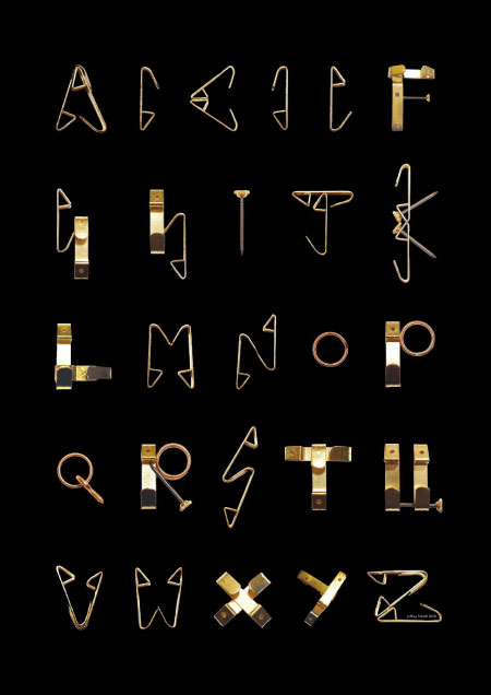
Hooks alphabet


Just found this via swissmiss again, thought it was very interesting, and particularly relevant to our elastypography project.

I particularly like the way they've used the dif views of the hook, either the side or the front. It gives a completely unique effect, especially when combined.

Wednesday, 29 October 2008

Turn it up

Another great website from the people who did the architecture in Helsinki website, they are a great little design agency called mathematics which you can check out here:
http://xy-1.com/new/


The website above is not only a great piece of work itself with great interactivity and a brilliant design, but is also a showcase for young creative people to show thier work. There is video, type, image and sound to have a look at it.

Definately worth a peak @ http://www.sbs.com.au/turnitup/

Architecture in Helsinki Website

This is a website that I came across when looking for a band to do my website design for.


It's a very clever drag n drop website, you basically drag and drop anything and everything. Drag the links into the main area to load them, move the windows around, drag images to make them bigger etc.

Despite this when I right click it doesn't appear to be flash, anybody know how they've achieved this?

Check it out @ http://architectureinhelsinki.com/

Sunday, 19 October 2008

Grids

Wim Crouwel was highly influenced by technology and grids. Unlike most typographers at the time he was convinced that he should work with technology and embrace the order that was needed for typefaces to work.

Similarly when I was given my typography project my first thought was to buy some gridded paper so that I could more accurately design letters.

Not only did he use grids in designing his work but he used it in his final pieces. To the left is an example of this.

Vormgevers (designers) poster 1968.
Font: Architype Stedelijk


Some examples of Wim Crouwel working in a gridded sketchbook to design his letters:


Here are a few of the letters we came up with for the elastypography project, where we had to use elastic bands and pins/nails to construct letter forms. We pinned gridded paper to a cork board so that we could get the 3d aspect of the letters as accurate as possible.


And finally in my finished poster I also used gridded paper in a design format.

Light:


Dark:


And surprisingly I did this before I'd even heard of Wim Crouwel. Bizarre eh? But in terms of work after I've researched Crouwels work I'm thinking about trying to design a typeface using only 45 degree and 90 degree angles. Or experimenting with new alphabet (if I can find a download) to see how readable words are if I mix the letters up.

Saturday, 18 October 2008

Wim Crouwel Interviews

Part one:


Part two:


Wim Crouwel interview made by french graphic design magazine "Etapes" talking about some of his work.

Thursday, 16 October 2008

Comparison.


A very much enlarged comparison between a Garamond 'A' and Wim Crouwel's 'A'. These were both printed on a dot matrix printer. The problem with the garamond A can be clearly be seen, there are no real smooth edges. The printer also often printed the dots completely different each time as it wasn't designed to deal with the shapes used in traditional typography.

Friday, 10 October 2008

Uneradbale


Interesting video about how Wim Crouwel's new alphabet made a resurgence in England in the 1990's. He also makes some comments about the typeface being "unreadable" and purely an excercise.

I actually disagree with him and think it is quite readable even with some of the more abstract letters such as the a or the m. On whole words: the human brain can piece words together simply by the beggining or end letter without paying too much attention to the middle.

But hey he's the typographer, or just modest possibly.

In all seriousness I can't see it working well in an everyday setting.

P.S. the title was deliberate.

Thursday, 9 October 2008

New Alphabet

For my typography project I picked the name 'Wim Crouwel'. After conducting a bit of basic internet research I found out that Wim Crouwell is a dutch graphic designer and typographer, most famous for his mordenist typeface: new alphabet(1967):


This font was also used on the cover of a compilation called 'Substance' (Joy Division, 1988) Funnily enough I'm a big fan of old music, particularly 80's altern and Joy Division are a favourite of mine.


Another fun fact: Apparently the 'N' on the cover is actually a 'M' in the alphabet.

I really love the alphabet that Wim came up with, it was based around the idea of dot matrix (I presume printers) and was meant to be made easier for computers to read. I think it really works because although abstract, the lines that he removes or adds don't take away from me being able to understand the word. Very cleverly designed and realised!

More to come soon.

Friday, 3 October 2008

This is Amy


Hello and welcome to my blog. My name is Amy Thornley and I am currently a first year interactive design student at Lincoln uni. In the near future I will hopefully be posting some interesting things for your viewing pleasure. In the meantime you can take a look at my work via the interactive design website located
here.